
Tuesday
Tuesday morning, as I would have assumed, we pretty much picked up were we left off the previous day, and watched back Mondays progress. This will most likely be a reoccurring feature in the editing process, and as far as I could assess from this morning, looking over the previous days work with a fresh set of eyes helps to pick out problems and mistakes that the long hard worked brain lets slip in the late afternoon of the previous day.
So.. what was achieved today. To start off, we got cracking on the opening scene between the characters Brandy (Alison) and Charlie (Peter) this scene was an odd editing experience. The reason I found it odd and unconventional was that the scene was a hyped argument between the characters but the odd thing was they was having this heated discussion through a closed door. Although the cut did come together quite nice, it was both odd for both the actors and myself in editing due to the lack of emotional reactions caused by the missing eye contact between the actors.
Now scene three was an awkward one for one main reason! Pace! And a clash between soundtrack and narrative. It only became apparent after it was edited together. The soundtrack plays from the end of the first scene, through the title sequence (scene two) and all through scene three. Now scene three opens up to a track shot of Billy (Andrew) and Roulette Dealer (Luke) then cuts into a dialogue sequence between the two. Problem is this dialogue sequence is in the middle of the soundtrack. This was the fist real editing problem we were presented with. The options were narrowed down to as follows:
Cut out the dialogue sequence to maintain pace of the soundtrack
Take the levels down or even mute the soundtrack thorough the dialogue sequence
Both obviously cause problems. But in the cut which one would be most beneficial for the story is most likely the one that will be selected for the final sequence. As of yet we have not decided on which to eliminate, but it is looking promising to drop the dialogue over the soundtrack.
Problems and Solutions:
Yes, as stated above. In short, Making crucial decisions over the two different routes of either dialogue or soundtrack should be informed and backed up by relevance to aid the script.
Tuesday, 12 May 2009


Monday, 11 May 2009
EDITING TIME! Entry One 6:27 pm
Monday
Monday morning bright fresh and ready to rock and roll with a huge virtual mountain of video captures sitting ready on the hard drive for myself (Editor) and James (Director) to spend pretty much all Monday morning choosing the cream of the crop, disposing unneeded captures and renaming files for reference to aid the editing workflow.
So in more detail regarding the workflow for this first step, to start of we had two folders named “Day One” and “Day Two” these names were a temporary measure from the capturing session after each days shoot hence the file names referring to the day of the shoot
From square one the first process in the workflow was to organise these folders into scenes. The most logical way to approach this was to look through the clips individually with the script in hand as a reference, and one by one assess the video clips against duplicate takes. We did this by opening each clip in finder and comparing it to other takes from the same camera angle. To make a successful choice at this stage, we looked for obvious continuity problems within the clip that would never be considered for the final cut, aspects like crew members appearing, boom microphones making an unwanted appearance and other problems of that nature. After such assessments were made, we would then remove what was not needed and drop the successful clips into there corresponding scene folders.
After that very long process, but most enjoyable at times (especially the bloopers ha-ha) it was time to set up a project folder in Apples Final Cut. Since all the files were organised and ready to go this made the process of setting it up with the scratch disks a breeze.
That was it the hard part over, or so it seemed, this opinion was soon to be changed! But that’s a story for later in the journal entry. In the afternoon I made a decision to slice and dice together the intro sequence, made up of arty farty slow motion clips. The clips look amazing alone! But when there edited together! The sequence was in a league of its own.
The idea of the sequence was to establish the visual appearance and attitude of the main location. Revealing a gambling, cheating, sleazy attitude with the contrast of a rich classy looking location where all this filth takes place. Without giving too much away, it’s a great little sequence and I am very happy with the outcome.
Problems and Solutions:
The only real problem was warming to the software again after a long time of not using Final Cut. Solved this problem by taking time on editing the intro sequence with no pressure.
Monday morning bright fresh and ready to rock and roll with a huge virtual mountain of video captures sitting ready on the hard drive for myself (Editor) and James (Director) to spend pretty much all Monday morning choosing the cream of the crop, disposing unneeded captures and renaming files for reference to aid the editing workflow.
So in more detail regarding the workflow for this first step, to start of we had two folders named “Day One” and “Day Two” these names were a temporary measure from the capturing session after each days shoot hence the file names referring to the day of the shoot
From square one the first process in the workflow was to organise these folders into scenes. The most logical way to approach this was to look through the clips individually with the script in hand as a reference, and one by one assess the video clips against duplicate takes. We did this by opening each clip in finder and comparing it to other takes from the same camera angle. To make a successful choice at this stage, we looked for obvious continuity problems within the clip that would never be considered for the final cut, aspects like crew members appearing, boom microphones making an unwanted appearance and other problems of that nature. After such assessments were made, we would then remove what was not needed and drop the successful clips into there corresponding scene folders.
After that very long process, but most enjoyable at times (especially the bloopers ha-ha) it was time to set up a project folder in Apples Final Cut. Since all the files were organised and ready to go this made the process of setting it up with the scratch disks a breeze.
That was it the hard part over, or so it seemed, this opinion was soon to be changed! But that’s a story for later in the journal entry. In the afternoon I made a decision to slice and dice together the intro sequence, made up of arty farty slow motion clips. The clips look amazing alone! But when there edited together! The sequence was in a league of its own.
The idea of the sequence was to establish the visual appearance and attitude of the main location. Revealing a gambling, cheating, sleazy attitude with the contrast of a rich classy looking location where all this filth takes place. Without giving too much away, it’s a great little sequence and I am very happy with the outcome.
Problems and Solutions:
The only real problem was warming to the software again after a long time of not using Final Cut. Solved this problem by taking time on editing the intro sequence with no pressure.
Wednesday, 24 December 2008
iphone Firmware 2.2 Update 2:06 pm
Yesterday i braved the long anticipated challenge of updating my iphone. as of this time yesterday i had successfully locked my iphone, and i was very unhappy to say the least. But with hours of hard work and playing around i managed to get it working and updated with the latest firmware 2.2.
Anyway after that, i have had a good old revamp of the system and upgraded it to a nice custom all black theme... adding some nice little personal touches also:

first little adjustment was so meaningless but so cool at the same time, you can download an advanced settings section and with this you can enter a custom name for the carrier, in my case i have replaced my o2UK logo with my name. [i want to name the phone, but cant think of anything relevant as of yet]
Next i have replaced the lockscreen slide button with a nice touch button that matches the theme. so so so much better to use. And the most obvious thing visible is the theme itself, its a combonation of theme downloads for the springboard, the icons and the lockscreen. It also goes into things like the SMS and changes the blue hi-lighting for black.
And seen as its christmas, i have added some flashing Christmas lights around the springboard, how jolly =D
Anyway after that, i have had a good old revamp of the system and upgraded it to a nice custom all black theme... adding some nice little personal touches also:
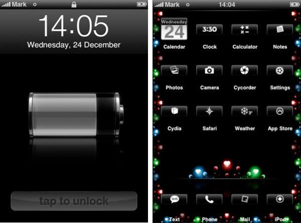
first little adjustment was so meaningless but so cool at the same time, you can download an advanced settings section and with this you can enter a custom name for the carrier, in my case i have replaced my o2UK logo with my name. [i want to name the phone, but cant think of anything relevant as of yet]
Next i have replaced the lockscreen slide button with a nice touch button that matches the theme. so so so much better to use. And the most obvious thing visible is the theme itself, its a combonation of theme downloads for the springboard, the icons and the lockscreen. It also goes into things like the SMS and changes the blue hi-lighting for black.
And seen as its christmas, i have added some flashing Christmas lights around the springboard, how jolly =D
Tuesday, 25 November 2008
PPD - Some Recent Job Desires 9:25 pm
Company: Eyeframe
Location: Soho, London
Found this motion graphics company in Decembers issue of Digital Arts Magazine. They Appear to specialize in DVD Menu production, which is very ironic considering the recent project.
Below is a shot of the DVD Menu as seen in Shane Meadows "This is England"
This Is England

This would be an awesome career to be involved in, Although there not taking on people of my experience, its a good level to aim for while still in education.
For much more info, Videos and other great assets can be found on the Eyeframe website:
http://www.eyeframe.co.uk/
Location: Soho, London
Found this motion graphics company in Decembers issue of Digital Arts Magazine. They Appear to specialize in DVD Menu production, which is very ironic considering the recent project.
Below is a shot of the DVD Menu as seen in Shane Meadows "This is England"
This Is England

This would be an awesome career to be involved in, Although there not taking on people of my experience, its a good level to aim for while still in education.
For much more info, Videos and other great assets can be found on the Eyeframe website:
http://www.eyeframe.co.uk/
Wednesday, 22 October 2008
Visual Effects And Motion Graphics: Final Production 7:33 pm
The Night before the deadline, and a cant hold myself from uploading the video before the presentation, so here it is:
Channel 4 Fear Season from Mark Braithwaite on Vimeo.
Very much looking forward to seeing other idents from my colleagues and presenting mine tomorrow.
Channel 4 Fear Season from Mark Braithwaite on Vimeo.
Very much looking forward to seeing other idents from my colleagues and presenting mine tomorrow.
Sunday, 28 September 2008
Beautiful Sunsets and Fisheyes 1:34 pm
Long time awaiting a wide angle lens, i finally executed a hot photo-shoot at Temple Newsam and the surrounding gardens. I just as i thought i had exhausted this place of photographs, i decided to try something new. Up until last night i have only ever took photographs during the day, so i challenge myself to do some nocturnal photography. As i ventured into the unknown, i was skeptical on what what about to be, and to my amazement, almost every photo i took looked amazing, although it was dark, there was a slight purple/red fade on the horizon, by exposing the camera, it picked these details up better that the eye can.
Here are some of the results, and bare in mind that i have done no color editing on them:

The mansions floodlights supplied some really nice light and shadows, and helped to produce this unrealistic feel that the images possess.
The gardens water fountain:

Please comment, Crit and enjoy =D
Here are some of the results, and bare in mind that i have done no color editing on them:
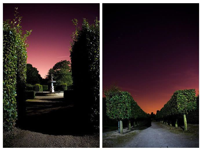
The mansions floodlights supplied some really nice light and shadows, and helped to produce this unrealistic feel that the images possess.
The gardens water fountain:

Please comment, Crit and enjoy =D
Looking at "Idents" 11:52 am
When Reading the brief for the first time, I had to sit and ask myself "what is an ident" this small little word of mystery, of course i had my gut feeling as to what it may be, but was not sure all the same. So to clear this little problem I had, by doing a little research into what its actual meaning was, i have not only found out for a fact what it actually means in the broadcasting world, but it has aided me to do more detailed and productive research on source material. The best description of "ident" also known as a "sounder or stinger" came from Wikipedia under "Station Identification" it displays a great description for someone like myself who has very little knowledge on what the word actually means.
Description Below:

from reading this, have now gathered that a channel or radio station uses an "ident" as a mark/tag or signature in a more creative and visually exiting way, by making this attractive it also works as a memory imprint to lure people into watching the station/ listening to the radio similar to advertising. When thinking of a really good existing example that i can analyze and inspire from, it clicked to look at the infamous channel four moving shape idents, as they are relevant to the same channel as the brief, and they also pack a punch of visual effects and are very memorable.
The Youtube Video Below Has Some Of The Best Examples:
some nice visual effects in those idents, but as i am aware these are idents for the channel alone, to do a "FEAR SEASON" will include footage of films that will be featuring on the "FEAR SEASON" including a signature ident to the channel, in the briefs case, this is channel 4 too. So in terms of research i need to look at and analyze how idents work alone, and how they work along side an advertisement for a series/season. also i believe it will be beneficial to look at how the footage in these adverts is structured by considering aspects such as the editing of footage, and he footage to moving graphic ratio, and in addition to this, researching and analyzing some physiological and thriller movies will help to inspire and develop some scene ideas for the story boarding of my own " FEAR SEASON ON CHANNEL 4"
found some idents for the BBC although personally i feel there not as identifiable as the channel 4 versions
Ident mntage For BBC ONE:
Ident montage For BBC TWO:
Description Below:
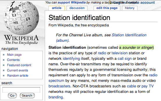
from reading this, have now gathered that a channel or radio station uses an "ident" as a mark/tag or signature in a more creative and visually exiting way, by making this attractive it also works as a memory imprint to lure people into watching the station/ listening to the radio similar to advertising. When thinking of a really good existing example that i can analyze and inspire from, it clicked to look at the infamous channel four moving shape idents, as they are relevant to the same channel as the brief, and they also pack a punch of visual effects and are very memorable.
The Youtube Video Below Has Some Of The Best Examples:
some nice visual effects in those idents, but as i am aware these are idents for the channel alone, to do a "FEAR SEASON" will include footage of films that will be featuring on the "FEAR SEASON" including a signature ident to the channel, in the briefs case, this is channel 4 too. So in terms of research i need to look at and analyze how idents work alone, and how they work along side an advertisement for a series/season. also i believe it will be beneficial to look at how the footage in these adverts is structured by considering aspects such as the editing of footage, and he footage to moving graphic ratio, and in addition to this, researching and analyzing some physiological and thriller movies will help to inspire and develop some scene ideas for the story boarding of my own " FEAR SEASON ON CHANNEL 4"
found some idents for the BBC although personally i feel there not as identifiable as the channel 4 versions
Ident mntage For BBC ONE:
Ident montage For BBC TWO:
Friday, 26 September 2008
Visual Effects And Motion Graphics 8:21 pm
After a long hard night at work yesterday evening, and an even harder day of racking my pounding head for some inspiration on the new brief now brings me to writing up the first blog of the project, and on that note, the academic year. Yesterday when I received the briefing on the Visual Effects Module, I had mixed feelings towards it. The brief in itself appeared to be a great, but I was in a way over anticipating how good it actually was, knowing about it from the end of the first year, I have allowed my self to build up expectation of a more open approach, and had all these ideas floating about in my head. As i know know, the brief is very specific and landed me and my pre return stewing brain right back to square one (I see this as a positive thing of course) Back to last night then, from the moment I had left college, there was a tie between the UFO-SI-FI Channel and the FEAR-Channel 4 breakouts, by the end of my shift, I had come to the decision of following the FEAR breakout. what were my reasons? I hear you all cry! Well I believe that the main and most academically justifiable explanation would be that the skills involved in creating "visual" and "emotional" material that is convincingly scary is by far the hardest emotion to capture. At this point of self assessment in my head, I was thinking.. OK so I have chosen FEAR, and to make this achievable, I am going to have to produce some pretty convincing material that can pass for hollywood quality SAW style horror, or its possible to go for a more comedy horror, with all the exaggerated blood and guts? but the brief does state psychological and thriller movies, so that narrows that pathway down to a prefered advantage. After a crap nights sleep due to suffering from the infamous man flu, I have been filtering through some DVDs to filter out some really nice inspirational source material that I can sigh at and say, ohh how I wish I could do that! But seriously, I have watched some nice motivating stuff today, especially on the good old Extra Features.
To start with, one of my favorite Shane Meadows films:
DEAD MANS SHOES

A great film to watch for gritty down to earth realistic horror, but with a twist of good nature mixed in to the chaos. Dead mans shoes is all about that grey "elephant man" gas mask, its unbelievably chilling, and awesome at the same time. As all gas masks are genuinely scary, when captured correctly on camera, they can send shivers down the spine, as it plays on that human cover up deformity feel. As i watched, and took note of the film, the use of sudden cut shots where an appearance is made then vanishes all of a sudden works wonders, its like a shark in deep water, you would prefer have a visual on the sharks thin "gas mask man" because when you loose that visual, all becomes calm, and that is even more terrifying.

Screenshot of the Gas Mask - Dead Mans Shoes
So the point i am trying to aim at from this particular film is that the sudden shock of this gas mask, then for it to disappear, this is the kind of material that makes us jump, and thus makes me think hold on, i can recreate this in my own style, its just considering where to put it into a television advertisement structure? at the moment I am not too sure how film season adverts look, or how they are structured. But this is something to look at as well as such inspiring source material such as this.
To start with, one of my favorite Shane Meadows films:
DEAD MANS SHOES

A great film to watch for gritty down to earth realistic horror, but with a twist of good nature mixed in to the chaos. Dead mans shoes is all about that grey "elephant man" gas mask, its unbelievably chilling, and awesome at the same time. As all gas masks are genuinely scary, when captured correctly on camera, they can send shivers down the spine, as it plays on that human cover up deformity feel. As i watched, and took note of the film, the use of sudden cut shots where an appearance is made then vanishes all of a sudden works wonders, its like a shark in deep water, you would prefer have a visual on the sharks thin "gas mask man" because when you loose that visual, all becomes calm, and that is even more terrifying.
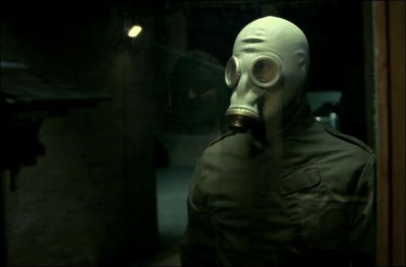
Screenshot of the Gas Mask - Dead Mans Shoes
So the point i am trying to aim at from this particular film is that the sudden shock of this gas mask, then for it to disappear, this is the kind of material that makes us jump, and thus makes me think hold on, i can recreate this in my own style, its just considering where to put it into a television advertisement structure? at the moment I am not too sure how film season adverts look, or how they are structured. But this is something to look at as well as such inspiring source material such as this.
Monday, 22 September 2008
Promotional Material 6:31 pm
During My college warm up period, I have been heavily involved with my band and our current run to get back on track. We have suffered a deadly year with our guitarist leaving, we managed to find a new guitarist who is amazing, and now the original guitarist has come back to the family.. thus engaging us to become awesome once again! we have been working very hard to get back into the groove of things, and we have produced some exiting new material, and hope to be giging before we see the year out!
But thats not the point of this blog, as i was saying about being heavily involved with this in terms of college, i have produced some new graphics for promotion and maybe even my first long awaited T-shirt design.
The design is still a working progress for final production, but is starting to take shape:

Maybe a little rude for a sensitive soul, although it doesn't bother me in the slightest, its a work of art, all digitally produced by graphic tablet and photography, followed by production in photoshop. Am still yet to send it into the world of the bands Myspace page to be rated by the people who matter.. the fans and band members alike! but all the creatives out there, give it a good citing
But thats not the point of this blog, as i was saying about being heavily involved with this in terms of college, i have produced some new graphics for promotion and maybe even my first long awaited T-shirt design.
The design is still a working progress for final production, but is starting to take shape:

Maybe a little rude for a sensitive soul, although it doesn't bother me in the slightest, its a work of art, all digitally produced by graphic tablet and photography, followed by production in photoshop. Am still yet to send it into the world of the bands Myspace page to be rated by the people who matter.. the fans and band members alike! but all the creatives out there, give it a good citing
Thursday, 18 September 2008
Second Life: Phonebox 3:39 pm
3D Modeling: Phonebox

Through recent creative struggles, I have produced something worth showing with no pre intentions of doing so. While checking out second life again after a long break away from it, i decided to test my building skills by recreating a imitation phonebox.
With the object being very squared and ridged, this made the building process fairly unchallenging in terms of technical and complex building, but hey, am happy with the outcome no matter how much, or should i say how little effort it took.

Through recent creative struggles, I have produced something worth showing with no pre intentions of doing so. While checking out second life again after a long break away from it, i decided to test my building skills by recreating a imitation phonebox.
With the object being very squared and ridged, this made the building process fairly unchallenging in terms of technical and complex building, but hey, am happy with the outcome no matter how much, or should i say how little effort it took.