Showing posts with label drawing. Show all posts

Friday, 24 July 2009

Me? a T-shirt Designer?

After great success and a really nice amount of positive feedback from my previous T-shirt design, i was content with my sucess and thought nothing more of the matter. Then a band that we have played with at previous gigs approached me to commission a T-shirt design. There was no real deadline, or work-frame to meet, other than it was as "cool" as the other one. Now my brain has started to tick, if am being approached by this band, is it possible others may follow in a similar fashion? especially if i advertise, and push myself out there? something to consider in the coming months.

The band in the spotlight this time is a local leeds metal act known as "Book Of Job"

http://www.myspace.com/bookofjobmetal

Check them out, there pretty awesome!

Anyway, being the kind fella i am, and knowing the band personally, i designed the T-shirt free of charge, i saw it as a way to assess if i was capable rather than just assuming i was producing a product worthy of charging. Plus it all adds to a portfolio =D

The design looks like this:


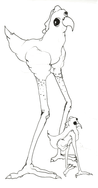
The design is made up of some abnormal octo legged creature, a suppose its an octopus, but am not 100% sure to be honest. The creature is sucking on a book, why? who knows! the bands name "Book Of Job" Encouraged the involvement of a book, and what you see is the result hah! In the sketching process, i drew the book before anything else! which is pretty odd really.

2 down now, whats next to come in the band merch saga?

Monday, 22 September 2008

Promotional Material

During My college warm up period, I have been heavily involved with my band and our current run to get back on track. We have suffered a deadly year with our guitarist leaving, we managed to find a new guitarist who is amazing, and now the original guitarist has come back to the family.. thus engaging us to become awesome once again! we have been working very hard to get back into the groove of things, and we have produced some exiting new material, and hope to be giging before we see the year out!

But thats not the point of this blog, as i was saying about being heavily involved with this in terms of college, i have produced some new graphics for promotion and maybe even my first long awaited T-shirt design.

The design is still a working progress for final production, but is starting to take shape:


Maybe a little rude for a sensitive soul, although it doesn't bother me in the slightest, its a work of art, all digitally produced by graphic tablet and photography, followed by production in photoshop. Am still yet to send it into the world of the bands Myspace page to be rated by the people who matter.. the fans and band members alike! but all the creatives out there, give it a good citing

Thursday, 31 July 2008

Illustrated Recovery


After a long drought of illustrated images, here is an ok effort created from todays boredom. The skin textures are rather nice, thanks to none other than the dodge and burn tools

Friday, 27 June 2008

Title Sequence for Dysfunctional Art

With this mini project i have set myself. I have successfully achieved two things rather than just the one. While learning the ways of Adobe After effects, I have simultaneously produced a nice working title sequence to represent my efforts in any future moving image productions i am involved with.

Using After effects and a photoshop document I created this:


I produced it from a hand drawn title font scanned from paper, and a photograph of this beautiful little cloud captured by my Canon D400. The cloud was all alone in the air as it caught my eye through the window as i was on the very computer i am tying this blog post, unfortunately the clouds outside at this moment in time are much larger and more populated and also much darker with moisture falling from them, I believe its commonly referred to as typical english weather?

Yeah, Comment... Criticize and ENJOY

Wednesday, 16 April 2008

Aesop Fable: My Inspiration

Like a large percentage of my personal work and my inspirations for it, and in this case! My Aesops Fable project. It all revolves around one man, and his outstanding ability of never failing to impress me.

Alex Pardee:


The unmistakable styling of pardee, with his black ink and brown paper is by a long shot one of the most influential creative styles in my design career to date. Not to sound really obsessed but this is the style I am aiming for in the animation of the Aesop Fable : The Chicken that Lays the Golden Eggs

Tuesday, 15 April 2008

Applying Video Filter Layers: Photoshop

With the animation that was posted earlier, with a feeling of in-contention, it was eating away at me to play with it further. Doing just that, i have applied a vintage look to my animation by applying a new adjustment layer in photoshop. By doing so, it has allowed me to do multiple things in editing the look and feel of the film.

Here are some examples:


I have noticed previously that this technique can either destroy or make a video. Its something of an art from. with the AESOP'S FABLES being hundreds of years old, i have gone for a destroyed vintage feel to give the animation some flavour!!

Here it is again!


Looks better already!

Monday, 14 April 2008

Flash Tutorial: Walk Cycle

Right.... Finally with a little blood and sweat, I have taken a design form my ABLE'S FABLE design. Imported it into Flash and animated a walk cycle. Similar to the photoshop animation previously, I have cut it up into "limbs" and animated it using the techniques I have learned earlier today. Problems in a technical view were aspects such as the motion tweening separate layers in conjunction with each other.

Below is the animation of a simple walk cycle across the stage:


Any good? I would say so, its for definite a good technical working start, next time i want to try getting more limb movement into the character.

More to come soon dudes and dudets

Thursday, 10 April 2008

The Basics of Animation

I have just discovered that i can blog at work! whohooooo

I sit here for 5 hours on a thursday bored out of my tree! or sketching of course.
I have been reading a book on animation, and the fundimental elements of animation. Upon taking onboard some very useful facts and infomation, I decided to have a crack at some very raw animation of my own.

Here is what I ended up with:


Not bad for a first attempt? Also the whole animation is one single drawing cut up into "limbs" of which are then placed on seperate layers.

Chickens and Golden Eggs?

Upon my recent decision to progress into the Aesop's fable: Chicken That Laid Golden Eggs, I have been submerging myself into the wonderful world of drawing. By drawing repetitive images of the same characters, considering slight variety tweaks still to be made, I have managed to development some rough characters for my fable design.


I am aiming for my own personal style, and warping the real form of a chicken into an abstract and disturbing version of my own:


The eyes look lifeless, this is an effect I will be aiming to achieve when it comes to animating the chicken/s. The long over exaggerated legs look obscure and quite frightening. Of course, with nice rendered textures, my visual will become more clear than in these liner sketches.

Below: I present to you all, something what is looking like a good final visual! Not set in stone but am liking the look so far.


To Come Soon:
Designs of the cottage people
Some first animation tests
Rendered Character Designs