With the animation that was posted earlier, with a feeling of in-contention, it was eating away at me to play with it further. Doing just that, i have applied a vintage look to my animation by applying a new adjustment layer in photoshop. By doing so, it has allowed me to do multiple things in editing the look and feel of the film.
Here are some examples:
I have noticed previously that this technique can either destroy or make a video. Its something of an art from. with the AESOP'S FABLES being hundreds of years old, i have gone for a destroyed vintage feel to give the animation some flavour!!
During today I have created a test sequence for a title or introduction to my interactive animation on the Aesop's Fables Brief. I have created the sequence using Photoshops frame by frame animation program. to do this, as before I have cut an illustrated character into what will become the moving limbs. These "Limbs' will then be placed into a new document ready to animate.
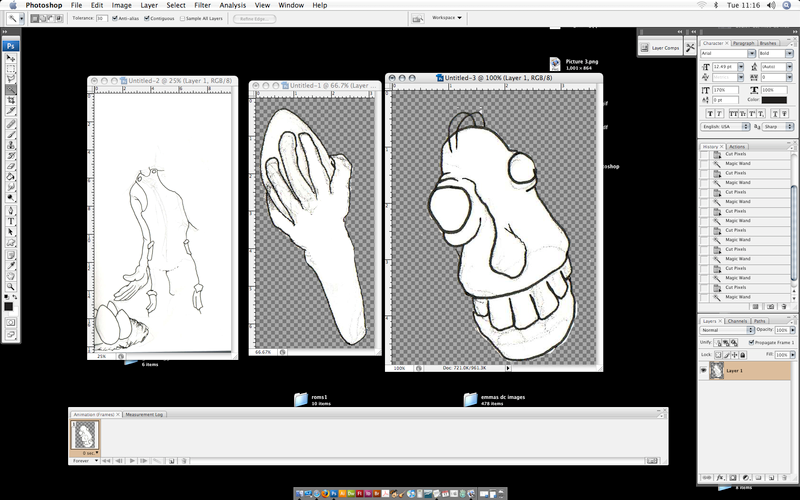
Below is a photoshop screenshot on how the limb editing process happens:
The separated limbs are put into A new document and are processed in the same way each time. By the limb being the only layer, It made it easier to erase the execs white surrounding the limb using the pen tool. From there, all the separate limbs are placed into a new document corresponding to the laws of perspective so that limbs in the backdrop will fall behind limbs in the foreground as the cross paths in the animation process.
After completion of the animation i wanted to input some audio to enhance it. In a horrid scuffle with the exporting in IMovie, I must have been doing something wrong down the line, as it was not exporting the video file, hence i ended up with a quicktime file of which only had audio and a black screen. So... i decided to be brave and try the audio editing in Flash. And what a result it was. I did struggle with it slightly, and still have only a faint idea on how it was managed, but luckily i produced a working animation with audio in sync. I did this by using the time lines and adding key frames where the audio would start and end.
Here it is, the end product of today:
Getting a little better, moving multiple things simultaneously was a good challenge to take on.
P.S: The line drawing is looking good as it is with no rendering involved. I will carry out some rendered tests purely to see the difference,but i reckon am favoring the linear approach
Right.... Finally with a little blood and sweat, I have taken a design form my ABLE'S FABLE design. Imported it into Flash and animated a walk cycle. Similar to the photoshop animation previously, I have cut it up into "limbs" and animated it using the techniques I have learned earlier today. Problems in a technical view were aspects such as the motion tweening separate layers in conjunction with each other.
Below is the animation of a simple walk cycle across the stage:
Any good? I would say so, its for definite a good technical working start, next time i want to try getting more limb movement into the character.
This morning in the Flash tutorial managed to FINALY pick up the techniques of animation in the Flash software. Discovering the techniques of motion tween and and motion guide, Gave birth to what is possibly thee worst animation ever made. However, the fundamentals of the softwares structure had at a moment of clarity.
Above shows the red circle and the motion guide of which was drawn with the pen tool. By snapping the animated shape onto the start of the guide and then onto the end. it applies its movement to the guided line. Great stuff
P.S
I off started the day off hating flash, and now am in two minds! it could be useful with some intensive practice.
When it comes to producing my animation, My mind is split down the middle in-terms of adding color and rendering to my drawings, only doing a basic hint of color, or not at all.
SO.. I decided to conduct some research into a linear style of animation and take further action from there.
I stumbled upon this animation:
The quality of realism that has been put into this particular stick man is really outstanding, definitely made me think twice about what style to peruse in my animation
I have just discovered that i can blog at work! whohooooo
I sit here for 5 hours on a thursday bored out of my tree! or sketching of course. I have been reading a book on animation, and the fundimental elements of animation. Upon taking onboard some very useful facts and infomation, I decided to have a crack at some very raw animation of my own.
Here is what I ended up with:
Not bad for a first attempt? Also the whole animation is one single drawing cut up into "limbs" of which are then placed on seperate layers.
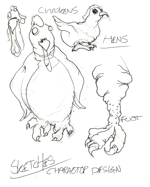
Upon my recent decision to progress into the Aesop's fable: Chicken That Laid Golden Eggs, I have been submerging myself into the wonderful world of drawing. By drawing repetitive images of the same characters, considering slight variety tweaks still to be made, I have managed to development some rough characters for my fable design.
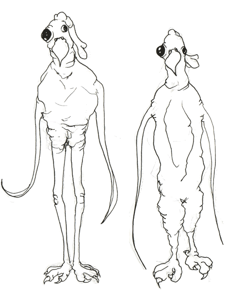
I am aiming for my own personal style, and warping the real form of a chicken into an abstract and disturbing version of my own:
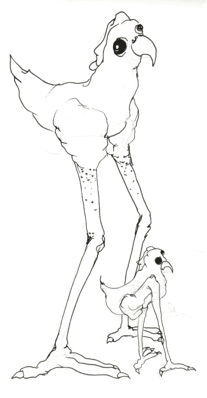
The eyes look lifeless, this is an effect I will be aiming to achieve when it comes to animating the chicken/s. The long over exaggerated legs look obscure and quite frightening. Of course, with nice rendered textures, my visual will become more clear than in these liner sketches.
Below: I present to you all, something what is looking like a good final visual! Not set in stone but am liking the look so far.
To Come Soon: Designs of the cottage people Some first animation tests Rendered Character Designs
Found a semi-relevant animation with good professional levels of sound and drawing skill. Good old donald duck gets up to no good as always, in a story of collecting eggs to sell for cash. along the way, he meets an unsuspecting character who is most unpleased with his act of taking the eggs.
The character is a cockerel, at first i could not determine what character fit what role.
after watching it over twice, i made out that donald duck is the Antagonist, and the cockerel is the protagonist.
In the easter break, I spent a fair amount of time with a camera, snapping away at any thing or where. When an upcoming visit to York was in my sights, I made it a desired plan to reconstruct a second version of my weird and wonderful manipulated representation of the York minster.
Some may remember the original Minster shot:
Using a Cannon D400 (DSLR) I stand central facing the building and take a series of over lapping shots to get that warped bending look as i photograph the sides of the minster:
Example of overlaying technique:
I would open the nine separate images into photoshop, and overlay them to the best of my ability to give it some form of real perspective. As photographer david hockney does, overlaying the photographs to create a bigger picture. In my case, i seem the edges of these images together to create a realistic photomerge as opposed to an obvious overlaying photomerge like hockney.
Here is my finished sequel to the York Minster Montage Series: